My hunch is that the square vs. circle convention is derived from paper forms.
The checkbox has been a common design element in forms for a long time. But people can of course tick off all boxes.
So when form designers needed to emphasize that you should only select one option, they often used a group of non-boxed options together with instruction copy that read “Circle one” (or similar).
The name “radio button” of course comes from physical buttons, but those were often square. So I think the specific circular shape is actually derived from circling an option on paper.
I had once thought the circle shape came from scantron style examination papers, where you can only fill one circle at a time. It’s similar even if the origins are probably different.
A lot of Scantron-style systems (including a lot of Scantrons) support marking multiple.
Yes, I had tests in the 1980s which were 'select all that apply'.
Radio buttons were also often round. The age of radio (and phenolics) was full of over-inflated round shapes.
But also, when you have a dozen monochromatic pixels to work with, 'square' and 'round' are pretty much the only usefully distinct shapes. Checkboxes were square for obvious reasons, so to distinguish a similar set of controls, you pretty much have to use a circle.
I'm pretty sure these concepts moved directly from physical systems to digital ones. Every person alive then knew what an empty square next to a line of text meant, and everyone understood the concept of ganged push-buttons. Just map it onto a pixel grid and you're good to go
> The name “radio button” of course comes from physical buttons, but those were often square.
It's just one opinion versus another, but in my experience early radios often had round buttons. I'm thinking of the kind of radios that preceded TVs.
Cassette decks certainly had rectangular "one choice only" buttons, but those came along decades later.
More crucially, when did we lose the ability to click and hold on the first checkbox and then drag down the list to set them all the same way!
> 1982: Dragging through a field of check-boxes flips the state of the first and assigns the new state to all other boxes dragged through.
On iOS you can swipe with two fingers to select multiple rows. One of the more hidden features. Mentioning it to show that we didn’t lose it everywhere.
What comes close are multi-select patterns. Often drop-downs where you can use the ALT-Key or dragging to select one or more items. Basically the same as in your beloved file-explorer and the list view. To archive a select all, usually there is a "select all" checkbox.
I don't know when I would use that. If that's something a user would do often I probably want some other design component.
In part it's because I don't like check boxes. They don't have great feedback about what's going to happen. If I designed a UI where someone is likely to check a lot of boxes, I would feel I had done something very wrong.
Sometimes it's unavoidable and so the framework might as well allow it. And as a user, designers often do things I wouldn't have. But I can say I don't miss having that feature.
Maybe when you have e.g. a list of items/pictures/datasets you want to select to perform some action with, e.g. download, export, or perform some bulk job on?
With pictures I'd rather use select features: draw a box, shift click, etc.
File choosers usually do something like that, rather than a separate check box component. You select the icon rather than a check box near the icon, so it's slightly clearer what it is you want operated on.
Ideally you'd find other ways to narrow the list. A long list of items is a UX disaster waiting to happen. The more you can categorize your data beforehand, the better off you are. If you can make it all-or-nothing, you're less likely to mis-click.
I really wish more file choosers would adopt both. Checkboxes are good for making complex, discrete selections that persist through accidental clicks. I can't tell you the number of times I've made a discrete selection of several items, only to lose it because the click misregisters on background instead of the icon
- [deleted]
Blender does this. It's sick.
When I see UI radio buttons, I often think about old radios, dishwashers, or washing machines, where you had two or three buttons aligned, and when you press one, the other(s) pop up (if they are already down).
I actually had a radio with circular radio buttons, which would pop back when you selected another option. It had switches instead of check boxes.
The one that drives me crazy is slider based checkboxes. I never know which side is on/off. Bad UI convention.
And speaking of checkboxes, I want an actual tick mark (checkmark), not a X cross. Its called checkbox, not Xbox or crossbox, it has to be a checkmark. Also, its a square, not a box. Disaster.
You mean those toggles that are very common on settings pages (i.e. in Android/iOS)? If they are colored, they are very easy to parse, imo, but it never hurts to actually write "on"/"off".
Those toggles actually mimic real hardware that used to be fairly common. I find those should be preferred over checkboxes for anything that takes immediate effect. If they don't, and you're collecting a bunch of options at once, in a form, then use checkboxes.
Some toggles are labeled terribly as well, so it’s not clear what “on” even means. Or double negatives so it demands that extra mental cycle just for the sake of having all the sliders to the same side in the default configuration.
Oh yeah, those are just objectively awful X)
>If they are colored, they are very easy to parse
unless the colors are red and green, and the user happens to be red-green colorblind. So yes, always have text indicate on/off as well.
I thought about more then two options. For example when you have 10 TV or Radio Channels. They are numbered from 1 to 10. And only one channel can be chosen. Or for example, you can buy concert tickets, maximum is 4 per purchase. You may want radio buttons with a number from 1 to 4. Or you have to choose a color or size for a t-shirt (Mostly they look like buttons but there functionality is radio).
Unlabeled slider switches were never particularly common.
For instance, my old stereo has push button toggles, where “in” means “on” (this convention was common because of how those switches work), and three way levers with labels on two of the three positions (there’s no space to label the middle position, and it means “default”.
I remember them on mp3-Player, Walkmans, Microphones and even Mobile-Phones. Usually on device that you want to lock or particularly turn on and off. And sometimes you have to push them hard with the help of your Fingernail.
- [deleted]
- [deleted]
Often enough they are on some websites settings, with (almost) no color, but labelled with imperatives. Option X: "activate". Do I press to activate, or is it already on?
> If they are colored, they are very easy to parse
Relying on color to make something easy to parse is an awesome accessibility choice.
They can be colored and adapt to accessability settings, including color corrections for different types of colorblindness or other impairments. All the toggle designs I've seen in the wild also have the space to write "on"/"off", a check/cross, etc.
That is why they are called "radio buttons".
That’s precisely the metaphor. A radio as in the radio station presets in your car.
iirc, radio buttons were an early form of bookmark in that one would rotate the tuner whose position was annotated by a scale marker, and when the radio was tuned as desired, one would pull the radio button, then push it in to set that button to that tuning. I have a memory of the tactile sensation in my fingers.
These are properly called "ganged switches" in the physical world.
And yes, radio buttons got their name from the push-button ganged switches that were ubiquitous on pre-digital radios.
Push button light switches that had two circular buttons with this behavior also used to be extremely common.
My stand fan for aiding in my skin convection cooling by forcing convection has 4 buttons, 3 latching power levels and 1 non-latching off button.
Our first TV was like this too - before remote controls.
And those buttons needed to be round, because you could turn them to tune the radio or TV to a station. Pressing the button would then "snap" the tuner back to the preset position of the pressed button.
Ok, apparently there were different ways this was implemented. I remember a friends old TV as a child, where it worked exactly as I have described.
This is similar to what I mean, although it's a radio, not a TV and the buttons I remember where taller and had ridges on the side so they could be turned easily.
https://herculodge.typepad.com/herculodge/2011/06/as-i-walke...
No they didn't. My first car had a Blaupunkt radio with buttons that worked like that, but they were rectangular.
I think turning the tuning knob typically popped out the preset button, and holding the button down while turning the tuning knob changed the preset. I think this could be done with a loop of string (to control where the dial arrow was) and few springs and catches (to pull the string into position when the button was pressed).
I can’t imagine how the mechanism would work if each preset knob was a tuning knob.
There was only one knob. To set a preset, you first pull the button out towards you, which released sort of a clamp internal to the mechanism, then push the button back in, and it would clamp on the string at the new position.
I'm gonna have to shoot a video next time I'm at my parents' place, aren't I? (The old Blaupunkt still serves as a stereo in the garage.)
Just have the knob rotation rotate a tuning element, and have the knob pressing switch the tuning element into the receiver circuit.
ISTR a discussion in Tog on Interface on the design choices available, with visual examples. This seems to indicate that the choice was made there.
You're thinking of a discussion about a hypothetical variant of the radio button, a "one or more" UI element. Discussion here on Lobste.rs:
https://lobste.rs/s/v6mkz6/implementing_one_more_ui_componen...
iOS has a history of using round checkboxes to muddy the waters:
https://ux.stackexchange.com/questions/116712/apples-round-c...
(they're not the only offenders in this monstrosity)
damn. stack overflow is gone for me. constantly logging me out (6 digits imaginary points) and showing me cloudflare annoyance almost every request. i guess i will just ask AIs trained on their content in the end.
Yeah, it has been prompting me with CF CAPTCHAS almost every time lately. Didn't use to do that, a few months ago.
Those captchas take more time than going to my usual LLM and asking there. Ironically their anti-AI crusade ends up making me use AI more.
Ouch. Can confirm.
Some paid services I’ve used for years have started aggressively automatically logging me out while I’m driving (eg when using the CarPlay app, which doesn’t include a login screen).
I really wonder what the PM’s are thinking.
> I really wonder what the PM’s are thinking.
Increase number of app downloads
Come to think of it, step 2 of the debugging flow for being hellbanned is “delete and reinstall the app”.
So, I guess they win?
What UI uses circles with checkmarks in them as “OK” buttons? iOS 26. Facepalm.
Can I see a screenshot of that? Sounds weird.
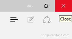
Isn’t that just the same as the close buttons that have existed in desktop operating systems for decades?
Eg https://www.computerhope.com/issues/pictures/close-window.jp...
I think people have long since learned that if an X is on the corner of a window, that is a button which closes that window.
Is it not just a circle shaped button?
They said it was a circle with a checkmark in it as an "OK" button, which is exactly what it is; they never said it was a radio button.
Here is a screenshot of what actual checkboxes and radio buttons look like on iOS 26 Beta 2: https://imgur.com/a/TwMRW4X
And Delphi
I would think actual radios.