Part of the reason I use RSS instead of getting my links through social media is because when I like something enough to subscribe, I want to read all of it. Not to "dip in". A paradigm where I sample articles means RSS isn't as valuable for me anymore.
I do feel a little urgency to keep up since some me my feeds cover stuff happening in the world, and lose value if not read promptly.
I've seen takes similar to the author's before and they don't resonate with me. Maybe we just have different relationships with technology. The same way a watch telling me to complete my rings has no power over me because that's not a goal I chose for myself. The watch serves me, not the other way around.
What’s happening in this site? The page loads and number starts going up from 47 and the it says “You fell behind reading this”. And I start scrolling and paras of text start floating up. I am really confused
If you scroll down slightly you get a low contrast button "○ PREFER STILLNESS? READ AS PLAIN TEXT →", which takes you to a plain text version with a rather patronising introduction that says "You chose the quiet version. No animations. No counters ticking up. Just words. That's a valid choice."
Edit: to be just slightly nicer about it: having a plain text version is great, that's a really good thing. But the "that's a valid choice" paragraph is unnecessary and just distracts from your actual article. If I pick the plain-text version it's because I want to just get straight to the point (other people may have other reasons), and I certainly don't need your validation.
I totally missed that button... It using tiny font size doesn't help
Sounds like what an LLM would tell me
Oh boy. You fell behind a lot. Everyone was waiting for you to read that page.
I think it's supposed to simulate the RSS inbox count creating urgency.
Hm, that was really unclear, I felt like there was a timer timing my reading, so I ended up closing it :/
This is "modern web design", I personally prefer a more minimal style.
If you turn on your browser's "reader mode" the article is more readable.
Did you try reading the text?
When I load the page, all the text I can see is "You fell behind while reading this". Not exactly helpful
I get an image of a mouse with a scroll wheel pulsing/moving. But it is quite subtle, and easily missed.
Funny that this pops up now, yesterday I was looking into using rss2email [1] and migrate all my RSS reading workflow inside mutt.
Ultimately I decided against it because I like being able to use a web-app based reader (Tiny Tiny RSS [2]) both on my work computer and my phone for RSS.
[1]: https://github.com/rss2email/rss2email
[2]: https://tt-rss.org/
Interesting read.
Actually I also think that email mailbox interfaces are shitty in general, including for emails.
For me, IM apps solved the problem correctly : one thread per contact. The thread goes up when something new happens. You can easily block contacts.
My mailbox sorted by date is a total mess. Having everything grouped by sender email would automatically make it tidy.
It's interesting idea but a lot of mail "contact" is either rare but still important, or one off thing that you read and/or remove/spam.
Funnily enough in old school mail client you could trivally make directory per contact via sieve filter but mainstream mail clients don't really want to give users much power.
> The thread goes up when something new happens.
But that's what sorted by date means, right? When you get a new mail, it goes at the top of the mailbox, and after new ones arrive, it goes down.
My mailbox sorted by date is a total mess. Having everything grouped by sender email would automatically make it tidy.
That works for single-sender mails, but most of my work mails have almost a different sent of contacts per topic. Grouping mails by subject (topic) makes this more manageable.
In all mail clients I've used, you're 1 or 2 clicks away from seeing your unread messages only, which greatly helps with filtering what's important to read soon.
This article feels off to me. It's such a human topic, but written in an entirely AI voice. I've been noticing this more frequently lately, and it makes things I read feel inauthentic.
It feels like some of our human-ness is being taken away. Writing is such a beautiful technology that carries ideas from one persons head into another. But now we put AI in the middle and I worry how much of the message is being corrupted.
I agree, but what's the alternative for some people?
What if most of these cases of AI usage is a matter of accessibility, not malice or bot spam, and the reason we suddenly see so much AI usage is because all these people never had a voice in english before?
To be clear, I assume the author here is well-intentioned, and I certainly don't see this as spam or malice.
That said, I'm sure that what I read now has more noise and less signal than it did a couple of years ago, which I find very sad. More and more of the writing I read daily is clearly AI generated, and it seems that a large proportion of it comes from people with a clear "quantity over quality" mindset. Even reading messages from people I know (who speak English well), I find it's frequently AI generated - I assume because they don't want to summon the effort to write it themselves, and find AI generated text "good enough".
yes, i mutter to the screen "why not just give us your prompt and let us think about it?"
Then you write in your own language or in broken English, or you study the language you want to write in? If you can't write a text at all (even with plenty of mistakes), you hardly can review AI output. So, you just let AI write something for you that you might not even mean?
This is not "I need to communicate with a doctor" or another necessity, if you put content out there, presumably it's because you want to communicate. You want to write in another language? That's great, learn the language and help yourself with a vocabulary, even a translator, but write yourself (which is also a way to learn).
I am saying this as a non-English speaker, as it might be obvious.
If I subscribe to an RSS feed it's because I'm interested in the content. I might appreciate better ways of filtering, but I still want to see all of the items in the feeds.
I do the opposite (eg, I read HN via RSS), and definitely don't want to see all of the content.
My reader (newsboat) is good at showing items at-most-once, and (at least the way I use it) punts to a browser to display content on the rare occasions I have further interest. Does this count as sufficiently-non-email-clienty for TFA's purposes?
Oh, I don't want to read all of the items. I tend to mark 90% as read as a first pass.
But I want to see the headlines/first couple of lines for all of them, so I can decide which ones I want to read in detail.
This was an interesting read for me. I'm mostly aware of the _problem_, however, never wondered how that could be fixed with other designs, I guess he is working on something that implements one of his proposals (river/window/bonfire)
I am one of the hoarders who has saved Inoreader items, a "Later" bookmark folder with (once thought as) interesting stuff in it, obsidian we clips for the ones what are so precious I for sure didn't just want to reference to but actually make a copy of. But it's under control. It doesn't give me anxiety knowing that I "should" go through them, because... I often do.
I'm surprised that the "first" of these layouts only appeared in 2002. I would have sworn I used Akregator since 1999
You're right, and the article is wrong. 3 pane layouts similar to desktop mail readers and Usenet clients appeared well before 2002. For example, if you look at the history of feedreader.com, there is a screenshot of a 3 pane layout on the front page archived in 2001: https://archive.ph/U9ZAo
That top message sorta put me off. Perhaps that's the intended purpose.
"82 You fell behind while reading this."
Okay, goodbye.
Honestly, I kind of feel the problem the author is trying to bring up, but I would still rather use News Explorer, set up some rules, reflect on my priorities, and go to therapy.
Attention economy is real and people’s monkey brains are being systematically abused, but at least in this very specific case, feeling bad because of urgency artifacts is just a skill issue.
The UI of RSS readers isn’t just a case of influence by adjacency. It actually reflects the underlying structure of RSS, that is a collection of feeds with multiple issues over time. Sure it can be revolutionized, but there are just so many other problems with the users need to focus on.
It’s not that the product lacks the potential of anesthesia over those pains. It’s just that when those particular pains happen, you need to face them head-on and not go around it with some fancy tech.
It is just absurd how such a powerful tool, a remnant of the OG internet that somehow survives, such as this tool for content distribution without algorithmic manipulation, makes people feel bad because how effective it is at bringing abundance.
Anxiety is just a disease and in this case a fancy UI is just a hit of opium. The problem is still there. Might as well just deal with it.
oh god why make it so difficult to read the article. i know there's a button for simple text mode. i know this is purely for style.
but why? this is something written to be read, is it not? it's not some kind of presentation, right? why ignore that job so entirely. this was so tedious.
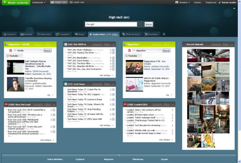
Has anyone made a FOSS reader with an interface like netvibes.com?
Tabbed pages, resizable and draggable boxes, per-box layout options: https://images.sftcdn.net/images/t_app-cover-l,f_auto/p/0281...
RSS readers look like email clientes because due to some osmosis with Usenet readers: https://web.media.mit.edu/~kkarahal/generals/VSpaces/usenet....
and such metaphor exchange predates 2002 NetNewsWire by far.
Many other misconcepts start from here on in the article. Like popularity of RSS due to this software and not due to people acquiring more Internet culture.
Even wikipedia article is off: "According to FeedBurner, NetNewsWire was the most popular desktop newsreader on all platforms in 2005."
NetNewsWire supported platforms in 2005: Macos PPC.
Am I getting all this wrong?
Yes! This is exactly why I gave up on my RSS feeds. I was paying for the client even ('Feedbin', iirc).
I trimmed the feeds way down, and now just receive a couple literally by email. Doesn't fix the feeling, but merges it with the rest of my email so it's just the one inbox's unread count.
If I were designing the interface, I think I'd do it like a book or magazine - except indefinite length. Each feed is a different book, new entries get tacked on the back. No unread count, maybe a sort of bookmark shows how far 'through' you are, but there's no particular expectation to finish, since you never will for as long as the feed's active anyway.
Interesting. I use Feeeed and find the feeds easy to navigate and consume. It’s not overbearing and sufficiently customizable.
I don't really mind the email interface that much, my main issue is that most RSS clients have it exclusively, without any second level of automatic filtering/sorting/triage. For many feeds that I subscribe, I'm only interested in portions of it, or I would want to filter out some topics, etc. So I have to manually go through heaps of stuff that only mildly interest me or often not at all, to find the few things I wanted when I originally encountered the blog.
I think the author's problem is treating email as chat.
The described problem doesn't exist for people that use email as email.
Google Reader, mentioned once in the text but not really explored, was a different experience. I pretty much stopped using RSS when that went away. Every other reader would either mangle the experience or add a paywall.
It had a magic simplicity that could be summed up as: "without me doing anything, give me the next thing I want".
Similar story with Google Podcasts IIRC, none of the current ones work the way that did either.
I don't really feel any sort of "phantom obligation" about RSS feeds. But I can certainly say it rings true in other areas of my life: Steam games, movies and TV shows, podcasts, books...everything is this growing list of things to do, that I keep adding to even as I'm trying to get through what I've already got in the queue. For video games, people often talk about their "backlog", as if it's important that they churn through all the games they've bought.
I have tried to remind myself in the past that literally nobody cares if I am behind on the TV shows I'm wanting to watch. Just me. So...I like the term "phantom obligation". I'll definitely tuck that away in my brain for later use.
My first RSS reader was a green text news ticker app on the mac in the late 1990's. I don't remember the name but it scrolled across the top of the monitor and I think it randomized the feeds. I'd love to have a clone of it for Linux and Windows.
As I was scrolling, I paused halfway along the quote blocks, and just saw a blinking "typing" indicator seemingly stuck. Gave the impression it was being LLM-generated on the fly or something, and waiting for new tokens
This email like tree system was even copied to the small screens of mobile apps. That's one of the main reasons why we built Fiper.net
> PHANTOM OBLIGATION
I thought we stopped making up new ways to feel like a victim. This is so dramatic about something nobody sane feels about their RSS feeds or even work emails.
If it's really that important, I have inbox rules and can be reached directly.
I like knowing what I've already read in my RSS feed and find it way more useful than the read status on emails. Emails may need to be referenced later, archived, or forwarded. Whether I read it isn't that relevant. I am a heavy user of "mark all as read" like it's a trip odometer reset button. I don't care that way about my RSS feeds because I'm reading them for leisure. The read status there is like a bookmark and I ignore counts.
I don't feel like I'm missing out for the same reason as email. If it's important I will eventually read it more than once by some other means.
> Every interface is an argument about how you should feel
If it is, it's not very effective on me. To me every interface is roughly equivalent in not having enough information these days. The design details are very quickly ignored once I learn how to get what I want. All the alternative layout examples shown are less informative so I hate them even more than the "email" layout.
I didn't read the full blog post but back when I was still using RSS I tried a bunch of RSS readers and they all had the same problem. They were "algorithmic" in the style of Youtube or Twitter instead of the email client UI that this blog post is complaining about.
I used RSS for exactly one thing: to follow releases of content that I didn't want to miss out on. For anything else HN, Youtube, or even just googling is good enough.
Well... We read text. We need UIs to manage the text flow/visible parts. Many websites could be read much better with Firefox Reader for similar reasons. Gnus (Emacs) concentrate news, feeds and mail in a single UI because of this, I concentrate most of my information in org-mode notes for similar reasons.
The real issue is explain to the masses that what we know is there for a mix of rational and legacy stuff mimicking we should slice. And that's a very hard issue.